Wacom Cintiq Pro 24 Review
The best overall drawing experience of any tablet so far?
Price
£1800, certified refurbished (2018)
Rating
4.5 out of 5
Summary
Wacom have really been upping their game recently, trying to fight off the competition. Wacom’s Cintiq Pro 24 is the best balance of display resolution and working area, and is unbeaten at this level when it comes to the raw experience of drawing and painting in a digital environment. Just don’t waste your money on the Touch model or the Pro Engine!
Pros
The screen size and resolution gives a great pixel density for an authentic drawing experience.
The Pro Pen 2 feels great to draw with.
With the edgeless design and new accessories, it really is a great looking piece of product design.
Cons
Expensive unless you can find a refurb - especially if you want the Touch model and Pro Engine.
Screen surface isn’t quite as textured as it could be.
Windows users will still be let down by driver issues.
FAQs
-
The Pro 24 is available at a few different price points; I picked mine up Wacom Refurbished so I got a reasonably good deal. At full price for the touch model, it’s on the expensive side. Add in the Pro Engine and you’re looking at the sore end of £5000!
-
The Pro 24, like all Cintiq, is a screen and tablet combo - you need a separate computer. Wacom do also make a Pro Engine but, chances are, most pro users who would spend this level of cash will already have their own high-end workstation.
-
There are two models of the Pro 24, with and without touch. The Touch is more expensive and, unless you’re absolutely determined and really like fingerprints everywhere, probably not worth the extra outlay.
-
Wacom have been developing tablet tech for decades now, but that doesn’t make a default win for them. With high-end mobile devices like the iPad Pro and Apple Pencil now available (and with no need for a separate computer), and other developers like Huoin coming along, Wacom have been under pressure to keep up with the market. The Wacom One and non-Pro Cintiq models show that Wacom aren’t just sitting idle, but whether that’s enough to hold their ground is yet to be seen.
-
There’s never really been a clear hierarchy; the Cintiq isn’t automatically ‘better’ because it’s more expensive and flashy than the Intuos. Some digital colorists, graphic designers and CAD techs prefer the desktop tablet models precisely because they don’t have a screen, where you’d be wiping your hand all over your toolbars without needing the benefits of pen motion, pressure and tilt.
-
Most users will already be accustomed to the ExpressKey Remote or traditional keyboard. You’ve already got a pen on the screen for pin-point accuracy. Anyone who has used an Apple Pencil will know the frustration when you accidentally skim the screen and send your image spinning into the distance. If you really do hate physical buttons of any kind - keyboard or Remote - then the Touch model is probably the one for you, but be ready to pay over the odds to solve that problem.
-
It’s not quite as simple as “bigger is better”. The 24 has a higher pixel density so it looks much better up close when you’re working on it, but the 32 is absolutely massive if you need the extra screen space.
Let’s get started…
Even the back panel of the Cintiq Pro 24 is nicely presented!
Wacom have pretty much cornered the market in tablets, both desktop-based (like the Inutous) and with integrated screens (like the Cintiq). Newcomers like Huion and XP Pen have started nibbling at the edges, but Wacom still holds the top spot; reportedly with a 99.6% market share in Japan as of 2019.
Most of that is down to the extremely affordable Intuos range, but it’s the Cintiq that remains Wacom’s flagship. As an aside, the Mobilestudio is an interesting prospect but prices itself out of most budgets, and ultimately finds itself struggling up against the iPad Pro (which is the only context in which the iPad wins on price).
Having run a Cintiq 21UX in my home studio for well over ten years, I decided to upgrade in 2018. I use a 27QHD in the office, so I wanted to go for a Cintiq with a little more screen real estate than the 21UX, and definitely one with a higher resolution. Enter the Cintiq Pro 24.
1. Out of the box
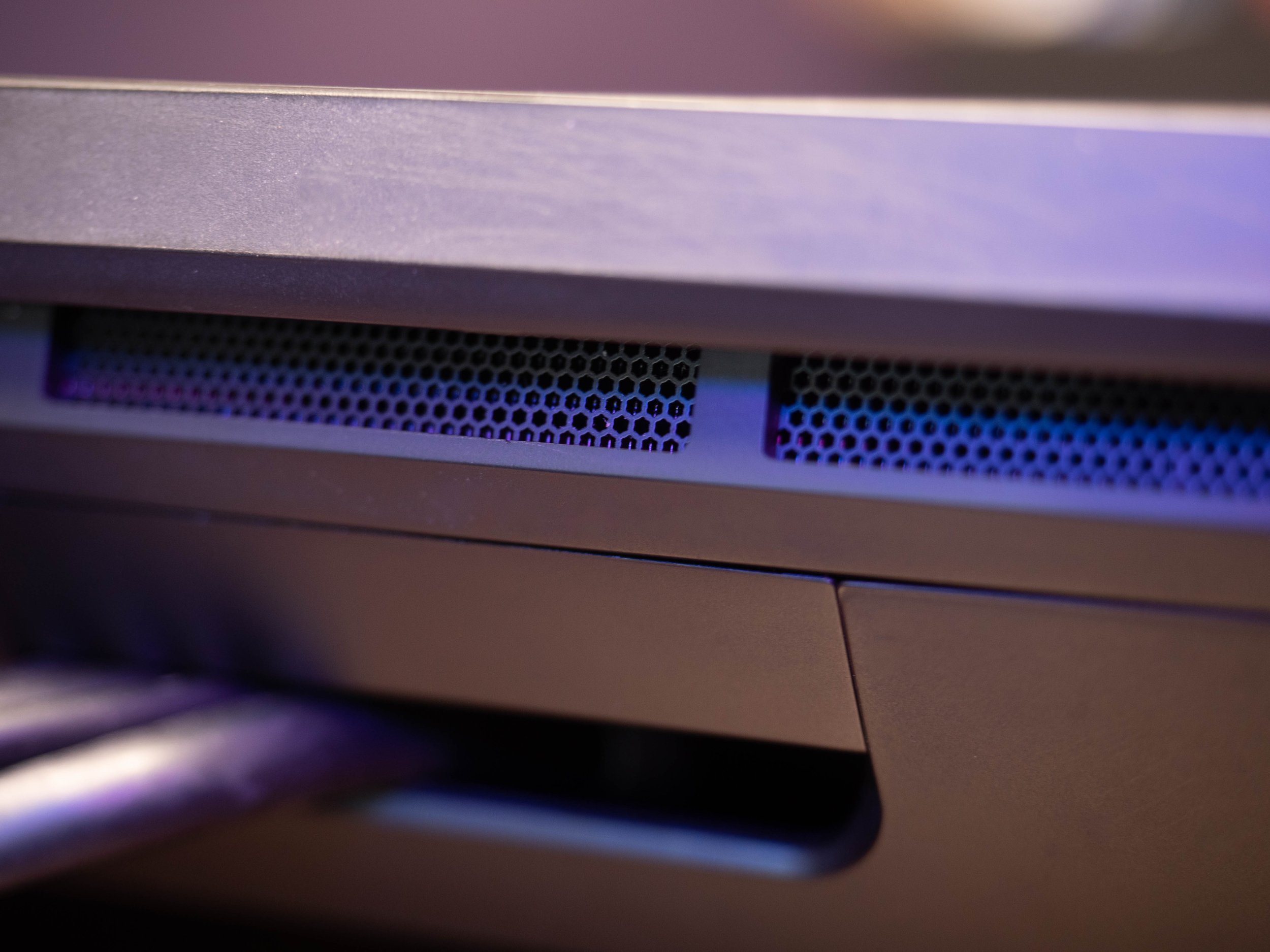
The Pro 24 comes from the factory with the Pro Pen 2, Expresskey Remote, and the usual spaghetti of cables for power and connectivity. It’s an impressive bit of kit, with bevelled edges that make it look almost like it’s floating above your desk, and a seamless screen/bezel design that takes the etched glass panel from corner to corner. It even has some really neat venting on the rear, which you’d probably never even notice in normal use.
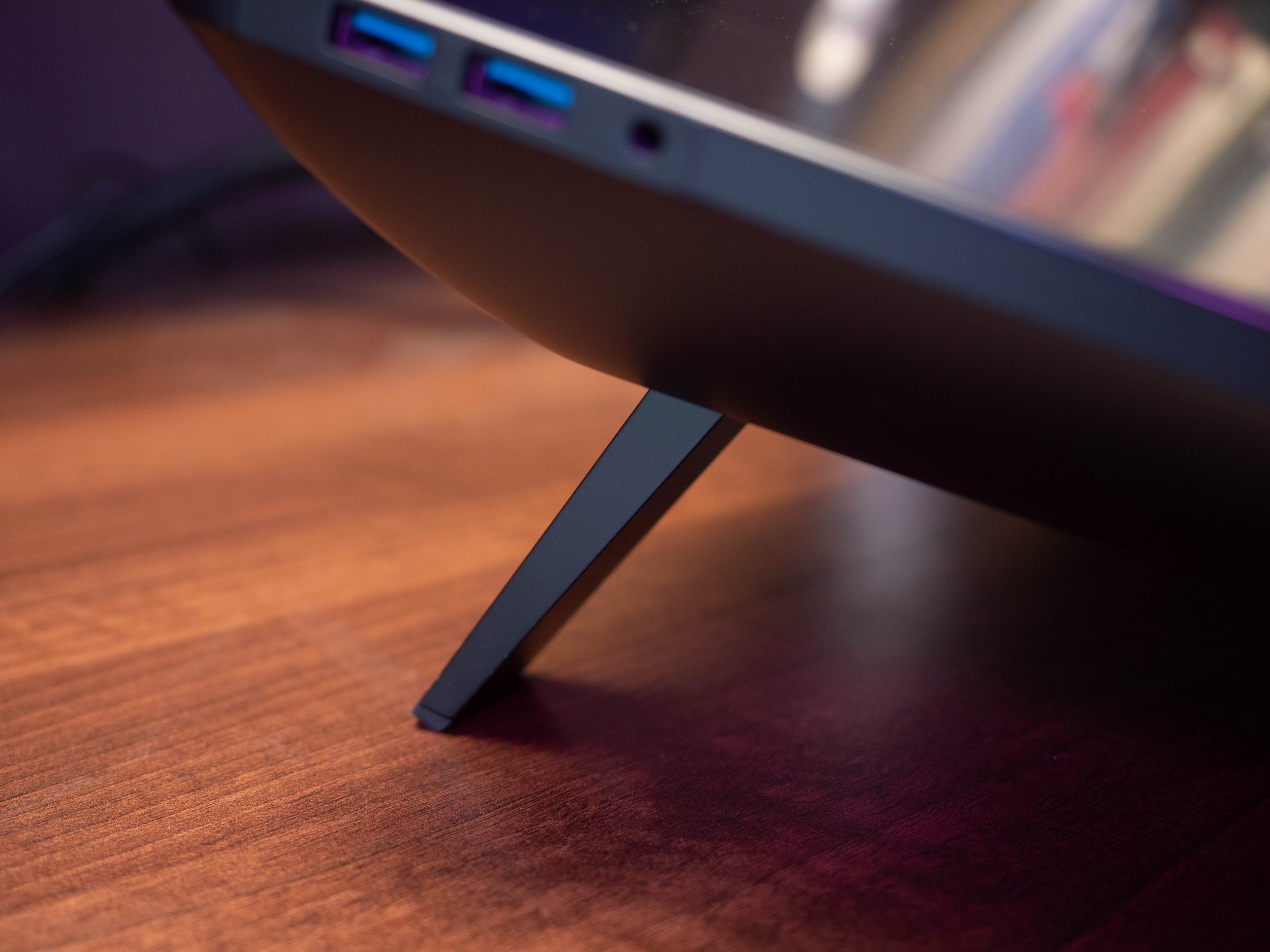
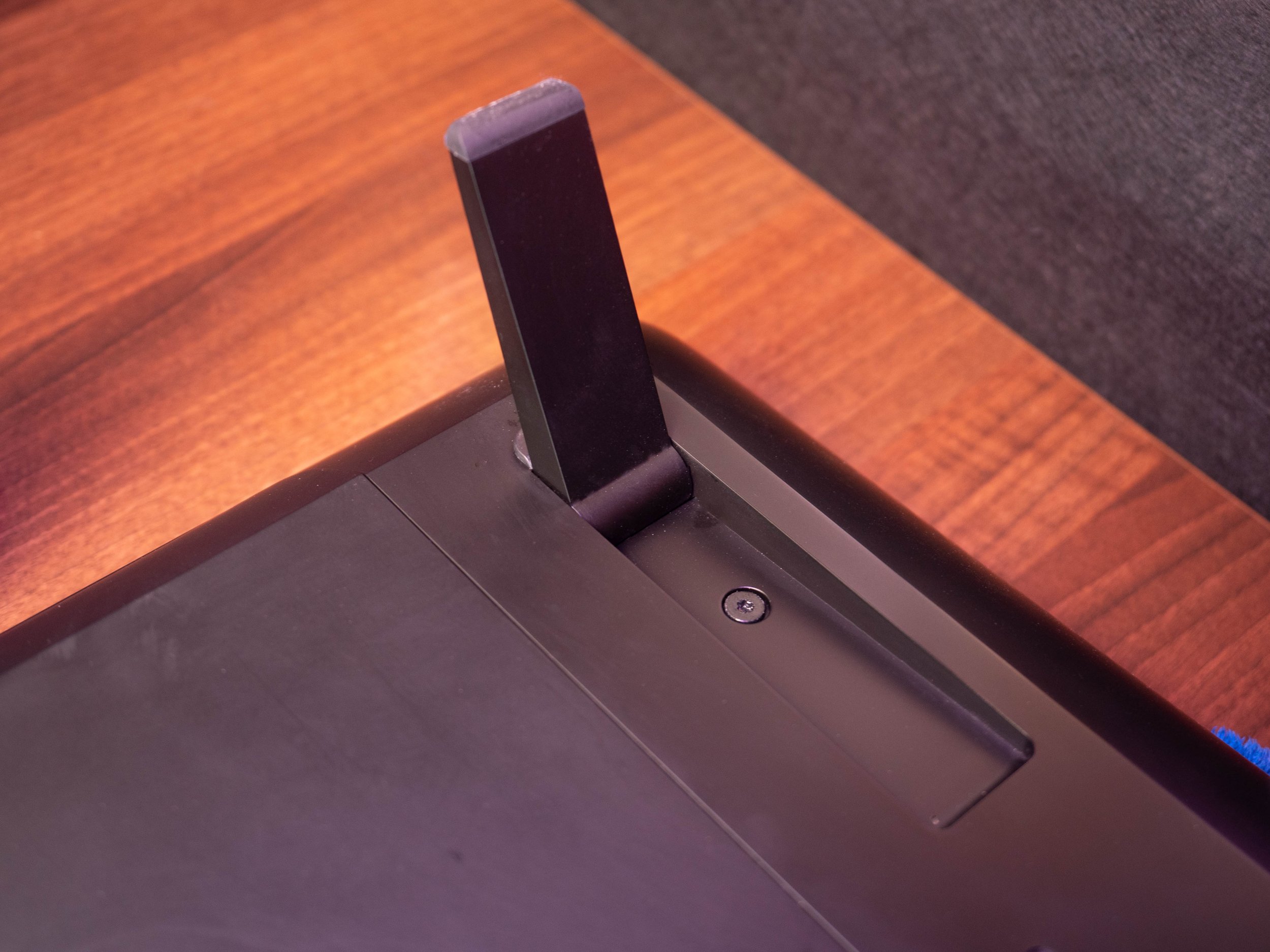
If you take a proper look on the back you’ll find a pair of weird looking little flippers in the top corners; these give you the choice of having the tablet laid flat or propped up at about 20 degrees. This is a big improvement over the huge separate metal scaffolding of previous generations.
If you want even more adjustability there are standard VESA mounting points on the back of the Pro 24, so you can attach it to a suitably strong monitor arm. Just don’t spend loads of money on the Wacom branded one!
2. Connectivity
The Pro 24 has the usual complement of power, data and display ports tucked away under its rear panel, including combined display/data USB-C if you want to save on cables trailing everywhere.
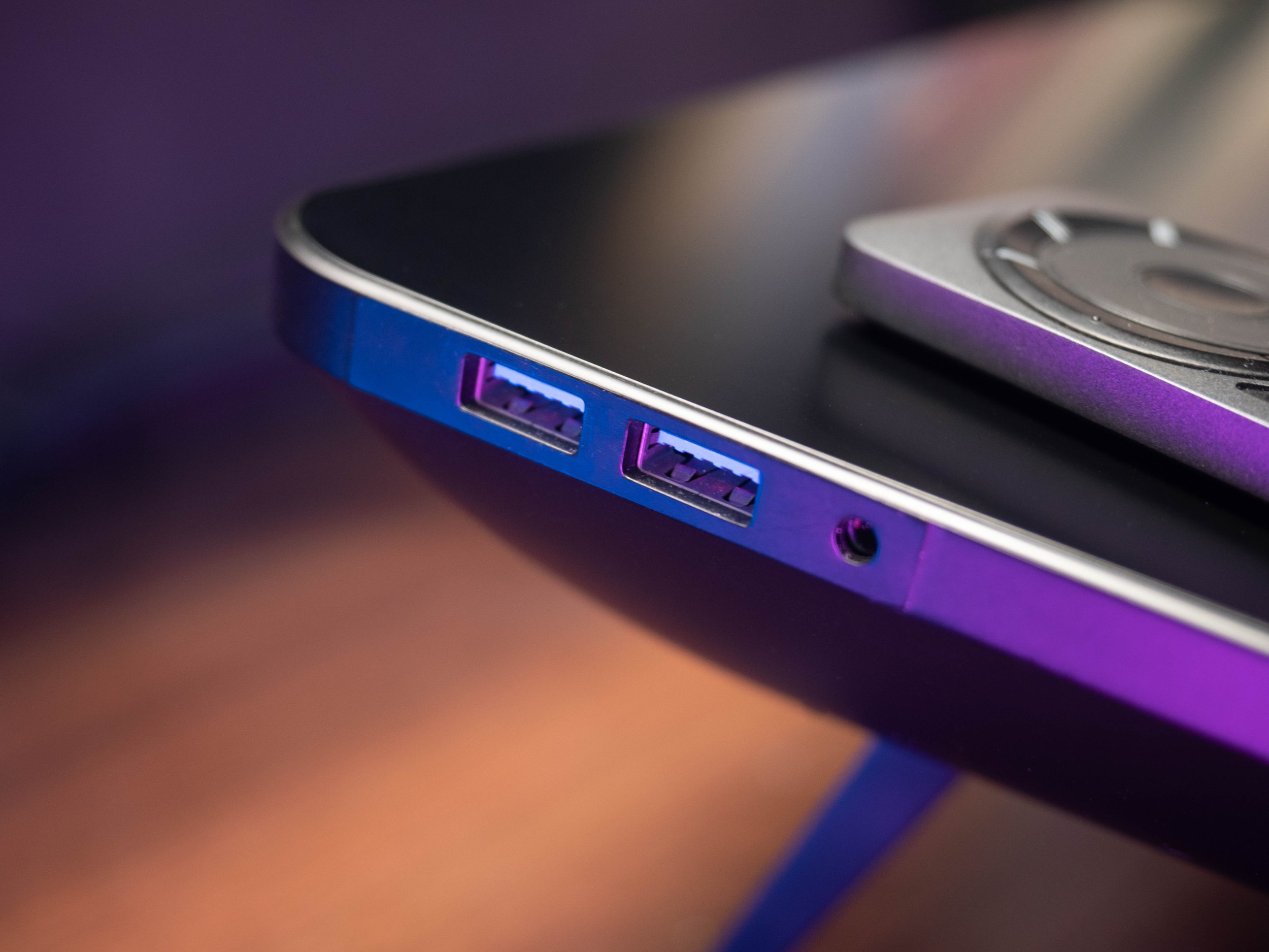
However if you do want wires all over the place, you can connect up to 4 x USB 3.0 accessories to the extra ports along the outer edges of the screen. If you want yet another cable trailing there’s a 3.5mm headphone jack and, weirdly, a built-in microphone for those impromptu lo-fi recording sessions.
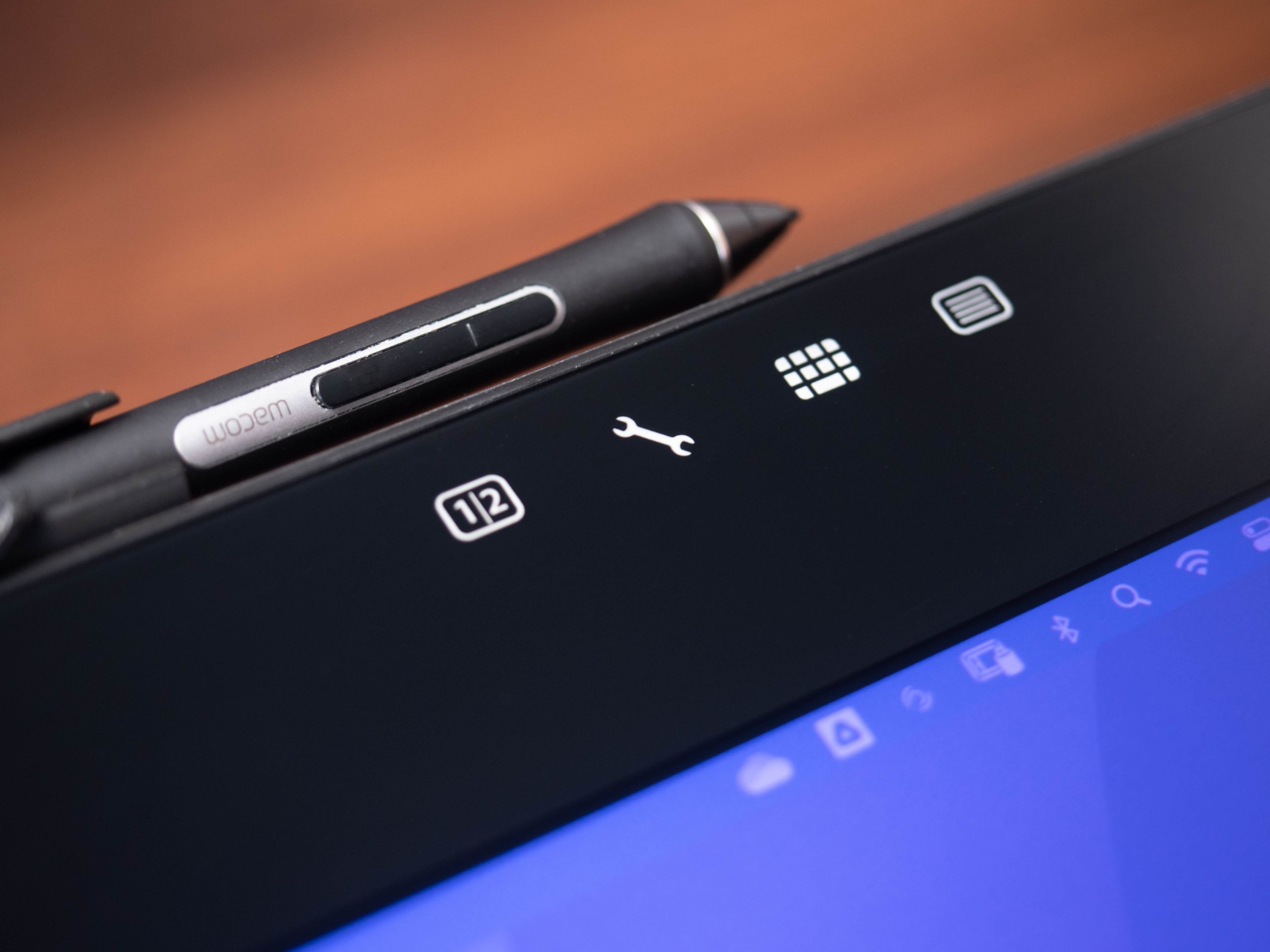
Like the other more recent Cintiq models the Pro 24 does away with physical buttons, except power and a couple of illuminated capacitive touch settings in the top corner. That means the return of the separate ExpressKey Remote which, like the rest of the tablet, is a lovely looking and well made bit of industrial design.
3. ExpressKey Remote
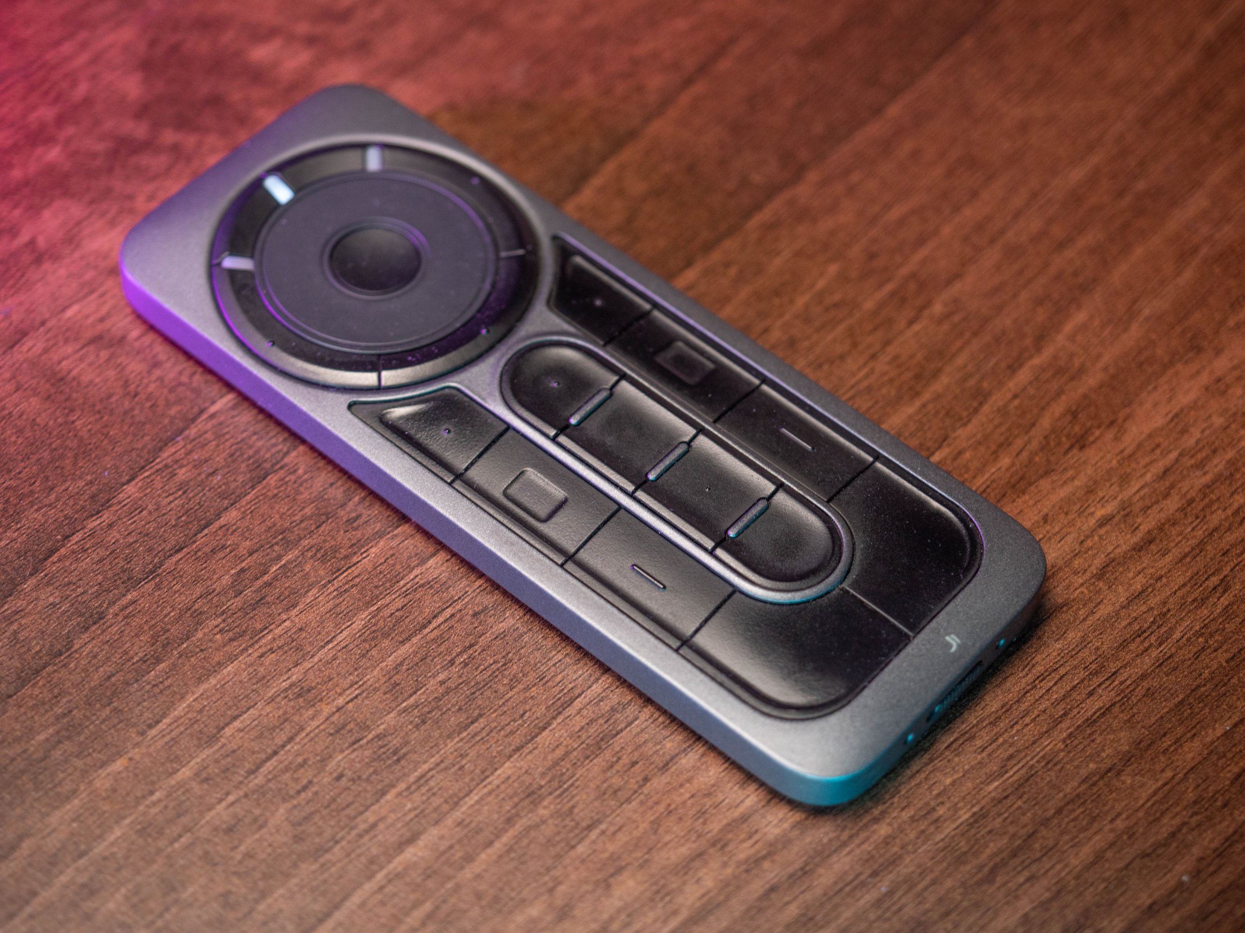
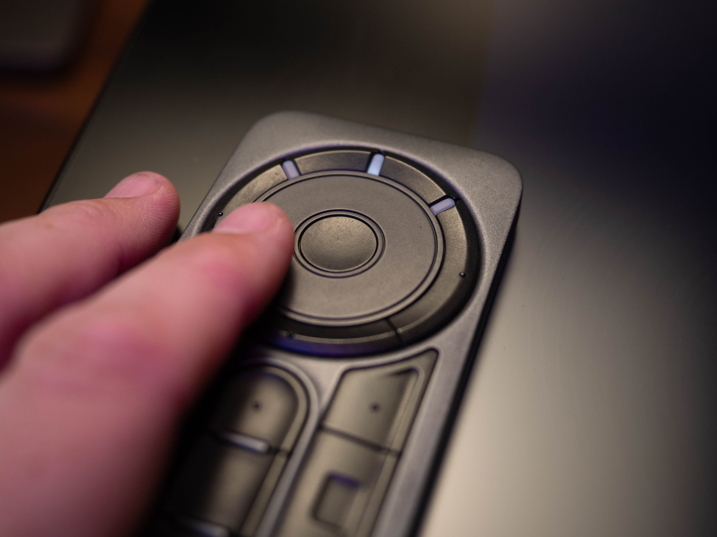
Landing on the desk with a satisfying thud, the ExpressKey Remote looks like it’s milled out of a single slab of anodised aluminium. It offers up 17 buttons and a touch-sensitive scroll wheel controller. They’re all decent sized with a properly satisfying ‘click’, and can be completely customised in the driver software.
Wacom claims that, if you press one of its button every 30 seconds, the ExpressKey Remote will last 160 hours on a single charge. With more important things to be doing with my life than testing that wild assertion, based on my experience, you can get a few good months out of it before you have to charge it back up via USB.
4. Pro Pen 2
Next up is the most important part of the equation: the pen. The Pro Pen 2 comes standard and, like every Wacom pen since time began, uses their patented battery-free electromagnetic resonance technology to provide 8192 levels of pressure sensitivity and tilt-angle responsiveness. To those of us without a degree in electrical engineering, that just means you get a great digital pen without cables everywhere and a drawer full of half-dead batteries.
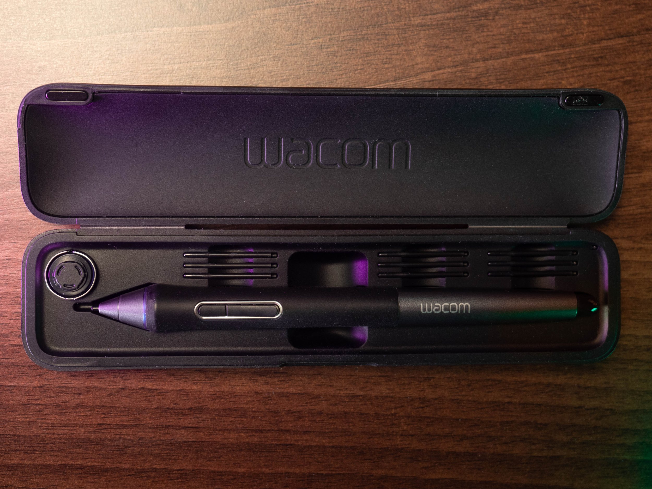
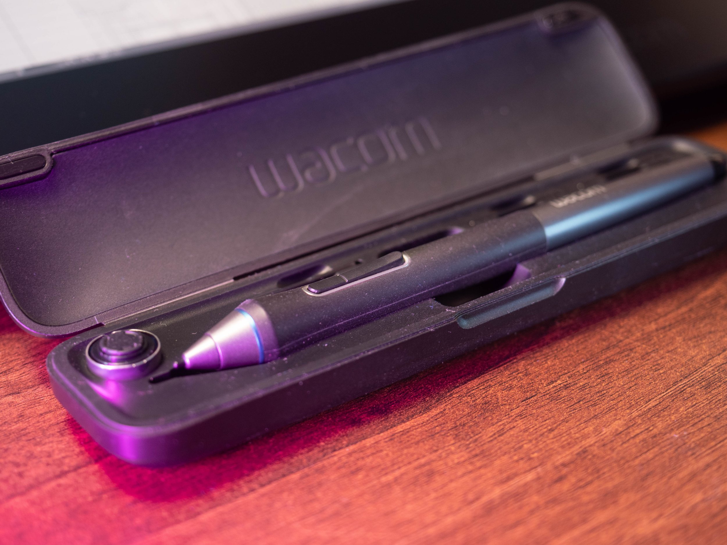
Out of the box the Wacom Pro Pen 2 comes with the usual mix of spare hard plastic and soft felt nibs. Its presented in a funky little case with all its kit, which feels super premium; opening and closing it has a satisfying feel and a pleasing little magnetic clunk.
Previous generations had a cool looking twisting inkwell-type holder (think the Barbasol can from Jurassic Park!), but the Pro 24 comes with a plastic clip that lets you store the pen directly on the tablet itself. Having lost track of countless - and worryingly expensive - pens in the past, this is a solid move from Wacom.
5. Drivers
The Wacom website has plenty of support and driver options, but you’ll probably just end up using the previous release to avoid software compatibility issues in Windows.
Before unleashing your creativity you’ll need to get everything connected. As long as you’re running Windows 7+ or MacOS 10+ you can plug into just about any computer with any level of spec; you’ll probably want something with a bit of power to get the best graphics out of the 4K screen though.
Once you’ve got everything plugged in you’ll need to download the latest drivers from the Wacom website. Before we get into too much relentless praise, this is where one of my very few gripes comes up with Wacom.
The relationship between Wacom drivers and the various software packages has always been a bit of a mess. If you’re the kind of person that likes those frustrating puzzle side-quests more than the main story of a game, you’ll probably enjoy trying to make Wacom, Windows and Adobe to play nicely together. But for the rest of us it’s just a nightmare exercise in switching frantically between complicated menus, tweaking settings, desperately trying to figure out why we’ve lost pressure sensitivity or all the lines have suddenly gone jaggedy.
6. The Screen
With the Pro 24 you’re getting a 24 inch diagonal screen at full 4K resolution (3840 x 2160 pixels if you want to count them), with the active drawing area filling that fully from corner to corner. I’m always hesitant to get too pulled into technical specs but, in this instance, it’s worth understanding the fiddly technical detail in relation to the ‘pixels per inch’ that you’re getting with the Pro 24.
I always thought that, particularly with screen size, bigger is better. The 27QHD I use in the office has loads more real estate to work in, but the quality of the screen has never seemed all that much better over the 21UX or 22HD that I’ve used before.
It wasn’t until I picked up the Pro 24 that I realised what the secret ingredient is: pixel density. In pixels per inch, it’s the relationship between resolution and diagonal screen size. The 27QHD, despite being enormous, only gives you 109ppi which is a paltry advance on the prehistoric 21UX, with its 94ppi.
When you’re at normal working distance you won’t notice the difference between 94 and 109 ppi… but what you WILL notice is the pixels themselves. You’ll feel like you’re playing Minecraft, and if you’re using your tablet for detailed drawing then you’ll be distracted by how jaggedy your lines look.
7. Pixel Density
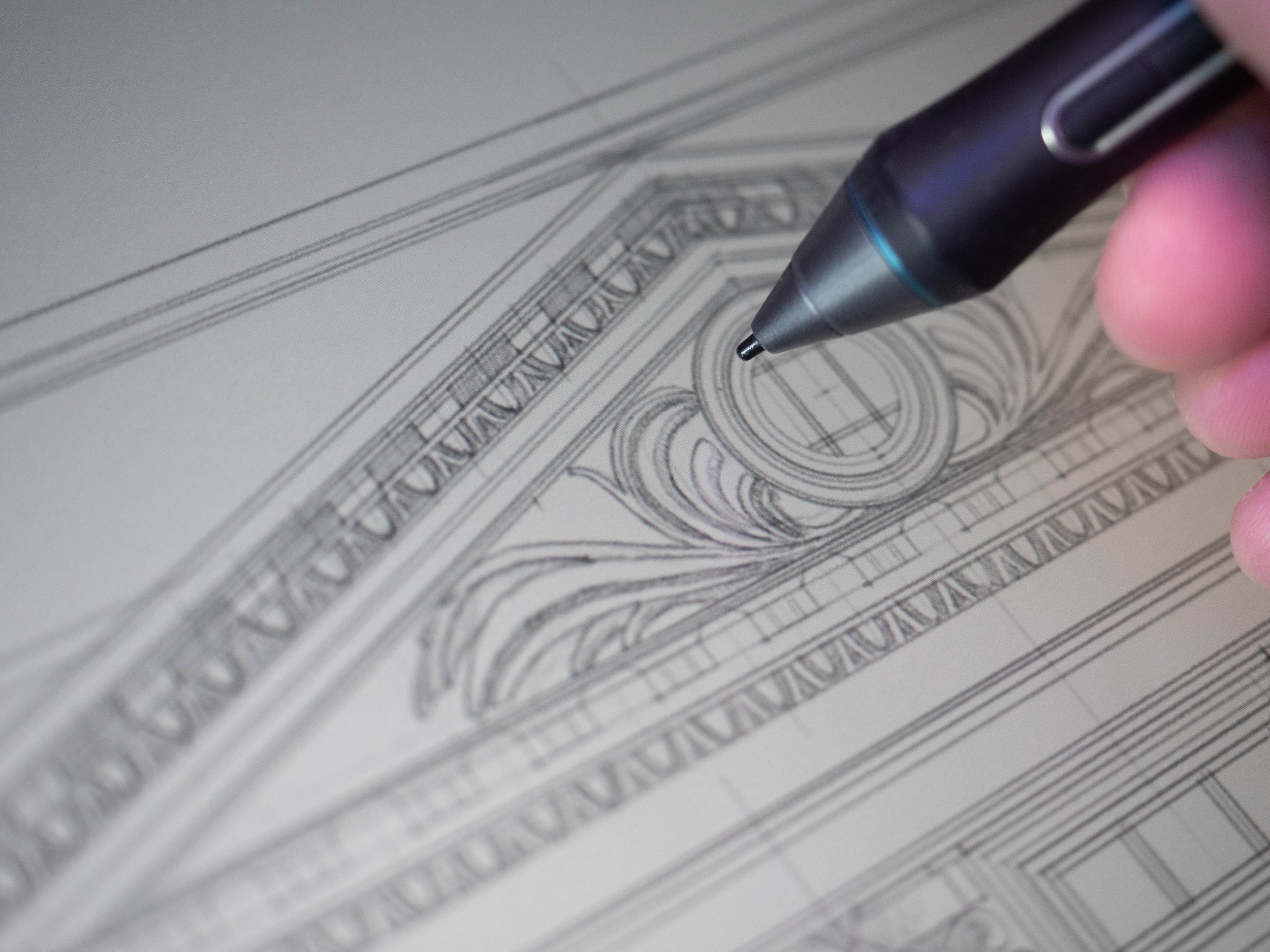
Even at nearly 200% zoom you can barely see the individual pixels on the Pro 24, which makes for a much more authentic drawing experience.
Back to the Pro 24: it has a whopping 188 pixels per inch. With nearly double the density of its predecessors you’ll struggle to pixel-peep on the Pro 24 with anything less than a microscope. My work is mostly detailed linework that in the tradition of analogue tools, with some colouring and graphic design, so being able to feel fully immersed in the process is important to me.
At that density my digital drawing tools look and feel just like their analogue equivalents, right down to the little flecks of ‘graphite’ you’d get from working in with a softer pencil. Interestingly it’s worth noting that the (same generation) larger Pro 32 model matches the 4K resolution but stretches it over 32 inches, putting that density right back down to around 140ppi.
For reference, iPad Pro gives you a retina-splitting 265ppi on the 12.9 inch model - but that’s no surprise as Apple have always been top dog on pixel density with their fancy “Retina Display” screens.
So the Cintiq Pro 24 gives you pretty much class-leading pixel density at its screen size, which is important if you’re working in fine detail. If you’re a digital painter who enjoys working on everything all at once then you’re likely better off with the larger Pro 32; or even the previous gen 27QHD, as you’ll probably be working a bit further back and not even notice pixel density at all.
8. Screen Surface
Drawing on the Pro 24 is about as close to looking like traditional media as you’ll get on a tablet screen.
With the Pro 24 you get a seamless piece of edge-to-edge tempered / etched glass over the top of all that. This makes it really look and feel like a properly premium product, which is a fair expectation at this price point.
Beyond aesthetics we do seem to have a slightly better surface finish on the Pro 24 as well, where previous models were a bit too glossy for my liking. This has the dual benefit of: 1) improving drawing ‘feel’ (your pen won’t skate over the surface every time you make contact) and, 2) cutting glare. That’s a pretty important one for me.
As I’m usually working in a studio with natural lighting the glare has been a major pain for me on previous models. I spend my time hoping I don’t catch a blinding reflection off the screen directly into my optic nerve, and always have to run the backlight on its highest setting so I can even see what I’m working on.
With the newer more ‘toothy’ texture you’re getting something that makes for a more natural drawing experience. Wacom haven’t gone as far as making a Paperlike surface where you’ll be able to hear your drawing before you see it, but that’s fine for me... I still remember the old Intuous models that had a super-rough surface that went through pen nibs faster than you can say ‘1200W Makita Electric Belt Sander’.
The Pro 24 is the best of both worlds for the moment… but if Paperlike do ever make a 24 inch screen protector, you can be sure I’ll be buying one to test out!
9. Cooling
Even the vents are really well designed, with a cool honeycomb pattern!
With glare and reflections no longer a major issue, you’ll be able to run the Pro 24 at lower brightness and backlight settings. I find this really helps the natural drawing experience, as you don’t feel as much like you’re just hunched over a massive computer monitor, and can focus on the work rather than the device.
Running lower screen settings also helps with comfort. Your eyes will feel less strained, and you won’t get so much heat sizzling off the screen. Previous models were really bad for that, to the extent you’d work up a sweat at your desk with a Cintiq in your face.
In response Wacom have finally installed fans in a Cintiq. The Pro 24 has internal cooling that kicks in every now and then to keep the temperatures down. You can even set how often you want them to run in the settings menu!
Some people are bothered by the fans, but I don’t think they’re that intrusive at all. They aren’t that loud and don’t really put any vibrations through the screen. And ultimately it’s a fair price to pay to avoid third degree burns whenever you get near it!
10. Pen Feel
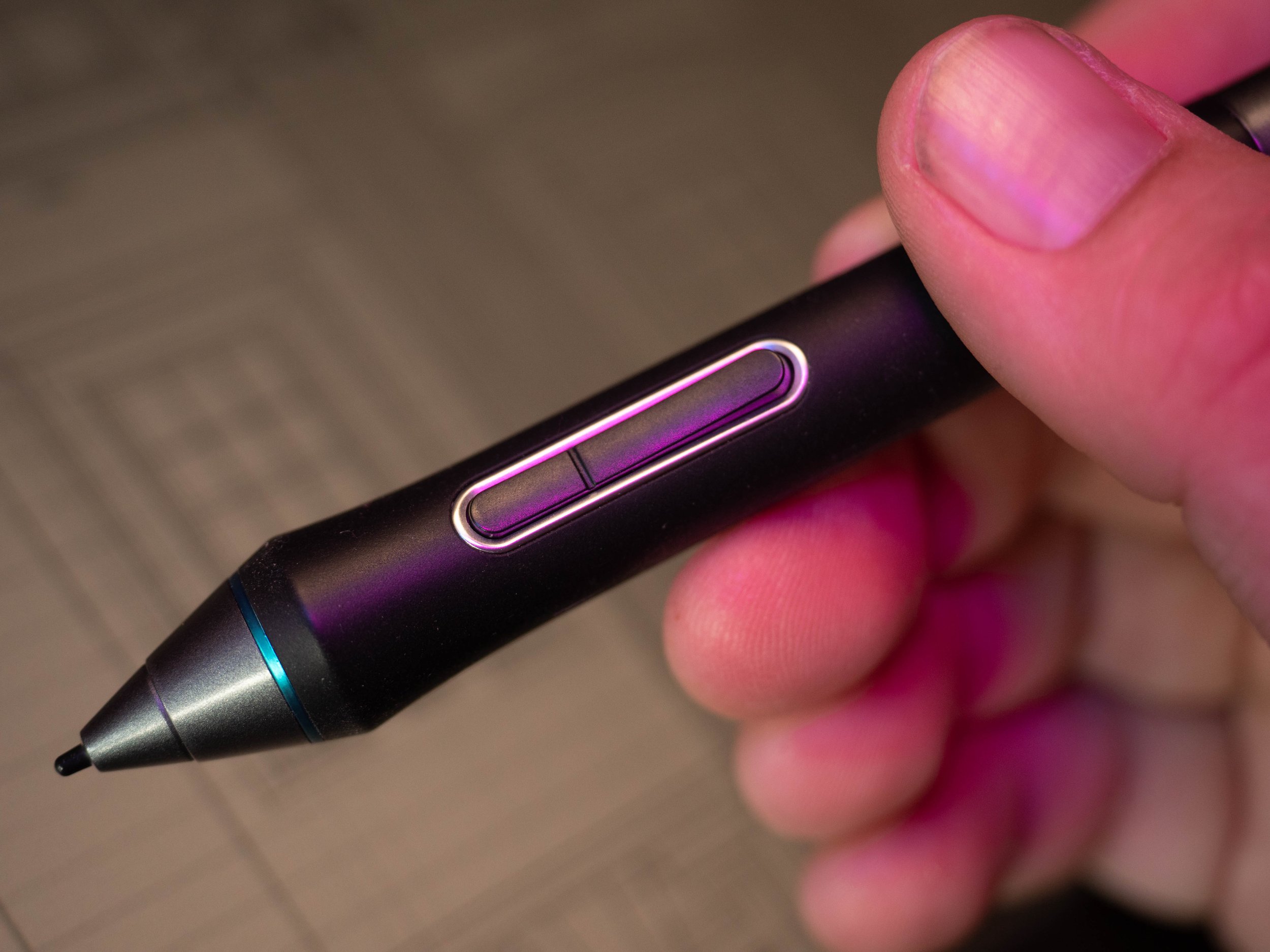
The Pro Pen 2 has two customisable switches on the side, plus an eraser on the opposite end.
Wacom’s pen tech has always been top notch; the pens are lightweight and well proportioned with customisable rocker switches on the side, and give you more pressure and tilt sensitivity than you’ll ever make use of. You’ve got a choice of nibs, but I tend to stick with the round-tipped plastic ones as they feel a bit more responsive than the felt ones (which also get grubby very quickly).
Drawing on the Pro 24 feels great though, whichever nib you go for. Physically it feels very natural, and the accuracy is pretty much spot-on. Before you get going it’s worth doing a full pen calibration, where you’ll sit at your normal viewing angle and tap the nib to little markers in each corner of the screen. This is a bit of a hangover from the previous generations of Cintiq, where the glass was so thick that you got really noticeable parallax issues (where the tip of the pen and the on-screen cursor don’t line up).
On the Pro 24 the glass seems thinner and closer to the screen beneath, which removes almost all of the parallax potential from the outset. It’s always worth calibrating anyway, as it can be quite frustrating if the cursor isn’t quite where you expect it to be when you touch the screen.
11. Custom Settings
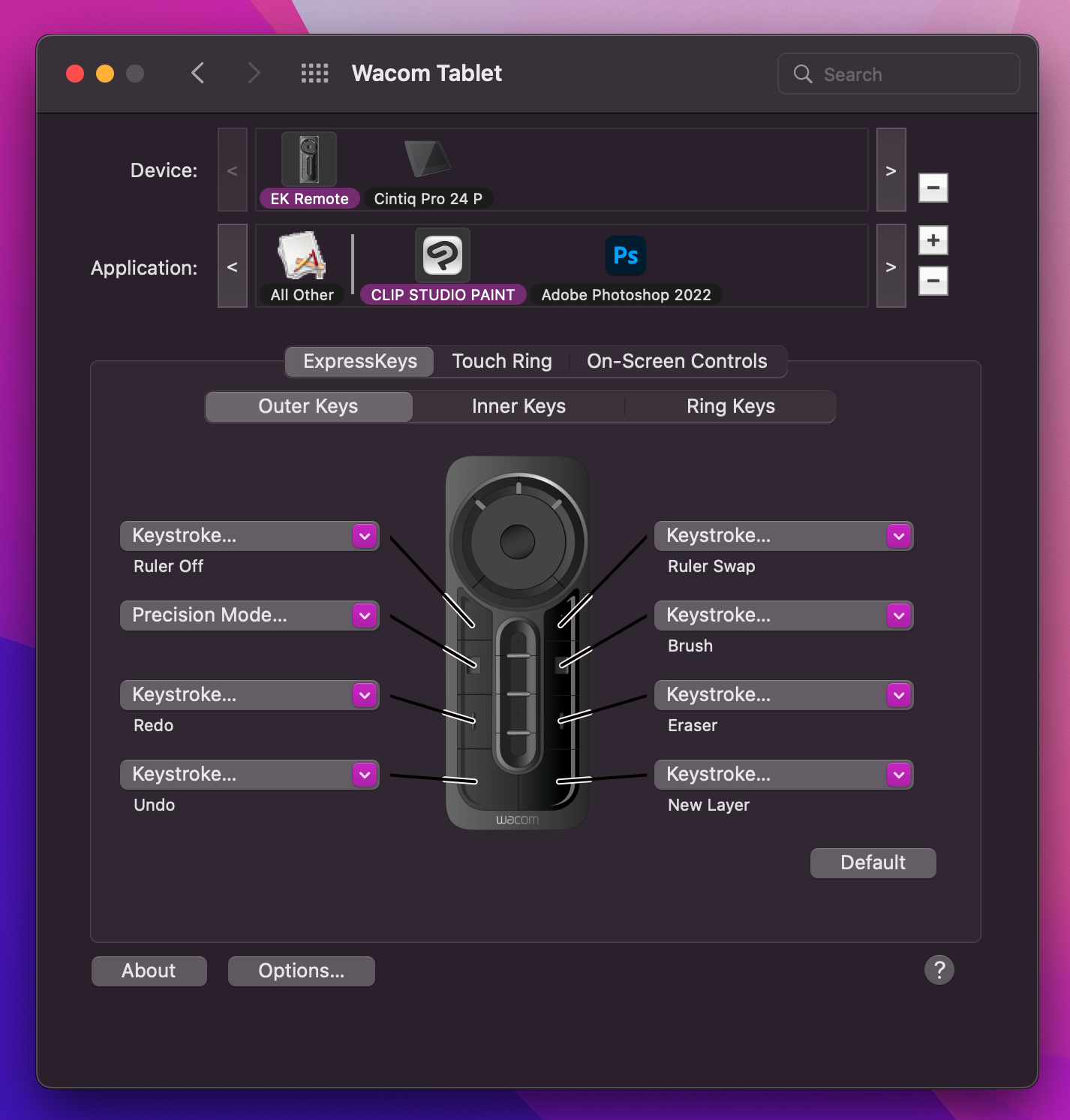
When you can get it to work properly, the Wacom driver software offers a huge amount of customisation. You’ll never use half of it!
Whilst you’re in the settings menus you’ll notice there’s an enormous amount of customisation available to you. As well as setting shortcut keys on the Remote, you can even set your own pressure sensitivity curves and click thresholds. Each application can have its own settings, and you can save your custom settings as different profiles, for almost limitless flexibility.
The ExpressKey Remote is where you’ll end up mapping most of your custom shortcuts. There’s plenty of buttons to work with, and a scroll wheel which you can map to zooming in and out, brush sizes, even canvas rotation. I have to admit that, even after nearly two decades of using Wacom products with these shortcut keys, I still don’t have much more than a couple of my most-used commands mapped to the Remote - I still find myself with a keyboard just off to one side.
You can also set your own custom colour profiles and screen settings; colour accuracy is another big thing for those digital painters that’s not too much of a worry for my type of work. The Pro 24 claims 99% Adobe RGB and literally a billion colours, but I always felt you’d probably use a proper calibrated second monitor if you were that concerned about colour accuracy. And anyway, from a less technical angle, I’d be dubious of professionally checking colours on a screen that I’d been smearing my sweaty paws over all day.
12. Summary
Over the years I’ve used all kinds of Wacom tablets at all stages of my career for all kinds of drawing, designing, painting, and modelling. I’ve bought them box-fresh, certified-refurbished and grubby second-handed. I’ve had good experiences, bad experiences, awful experiences, and (thankfully) some really spectacular experiences with Wacom tablets. I’m pleased to report that the Cintiq Pro 24 is open the spectacular side of the table.
I’ve been running my Pro 24 for nearly 3 years now, and can safely say it’s one of the best tablets I’ve used so far. As a complete package of specification, usability, build quality, design quality, it hits all the marks. I’ve mentioned a few minor gripes with the driver issues, pricing, and some possible improvements on screen texture, but otherwise it’s a great bit of kit. The Pro 24 screen is the perfect balance of resolution and size to give a high pixel density, which is such an important part of having a natural drawing experience.
But, as easy as it is to get caught up in technical data and passionate reports of great drawing experiences, the decision on whether ANY Cintiq is right for you comes down to what you’ll be using it for.
Professional designers and artists will find a use for every single one of the Pro 24’s pixels, and a keen hobbyist will give themselves plenty of room to grow. For a beginner or casual creator, though, the Pro 24 is massive overkill. Until you know exactly what you qualities you need in a device to help you do exactly what it is that you do, it’s not worth investing in this price range of tech.
Make sure to leave a comment below with your own thoughts on the Wacom Cintiq Pro 24!


